Colour as an organising device
A visible feature to consider alongside your own programme, users and operating requirements.
OFFICE / Design reference
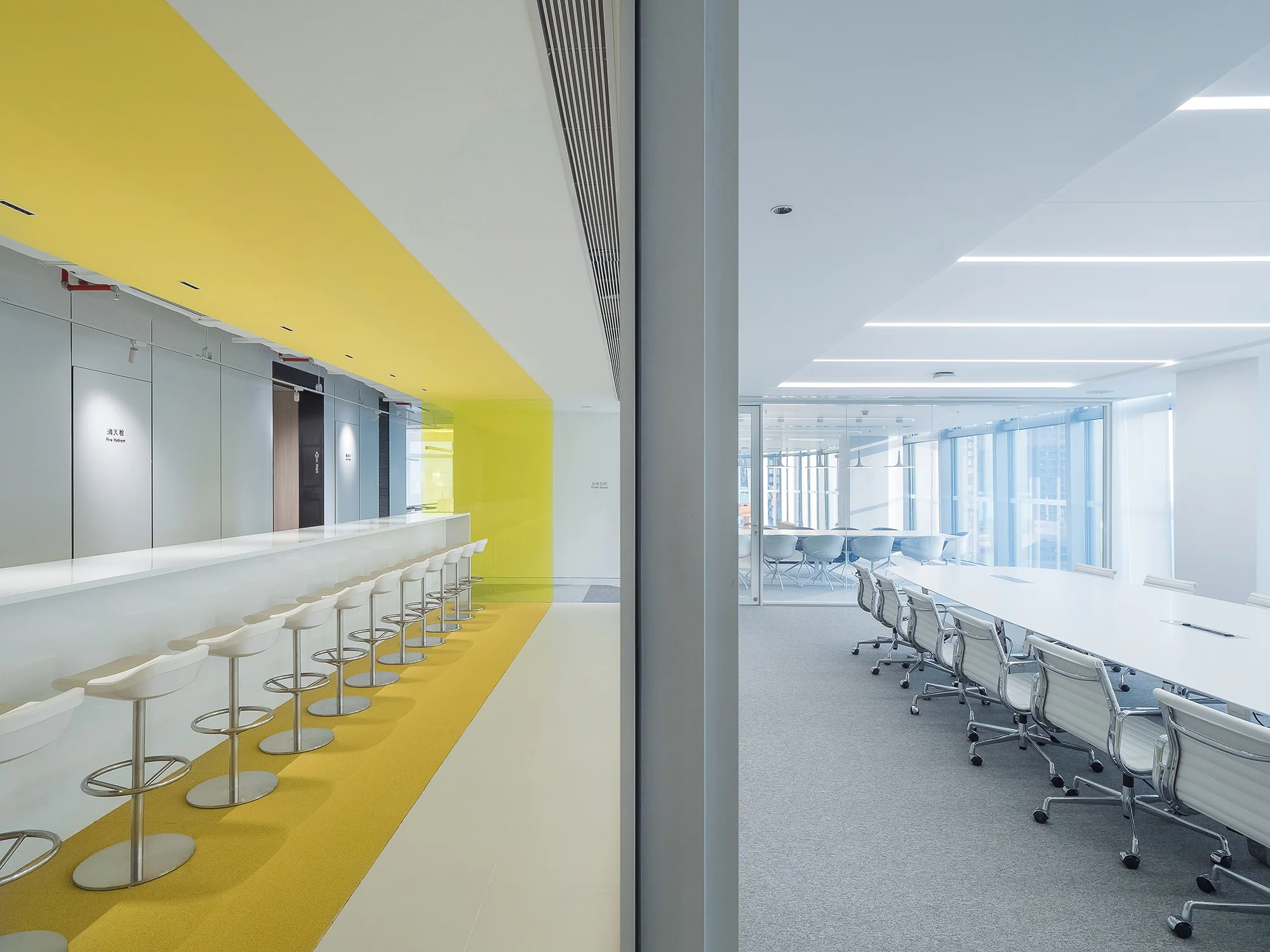
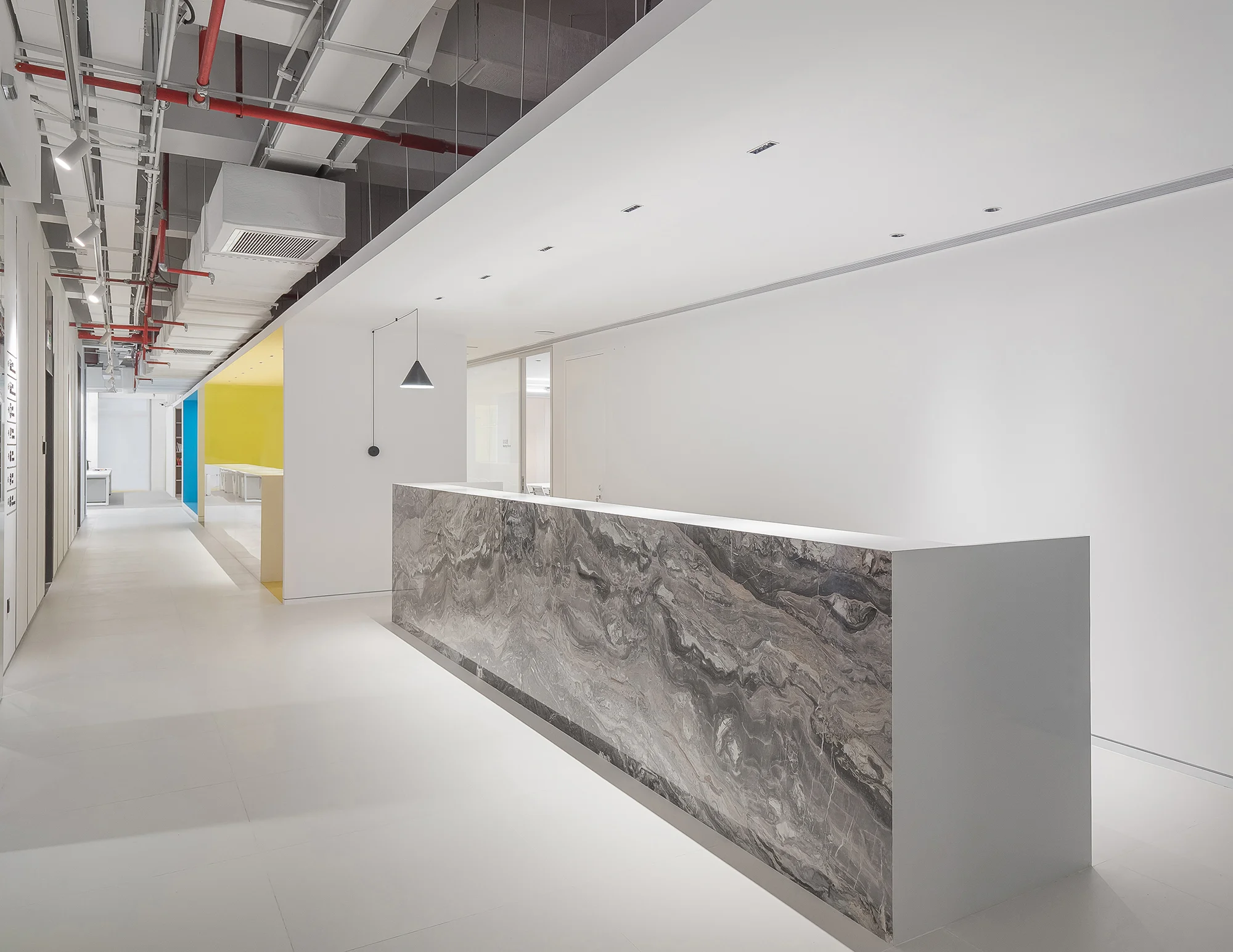
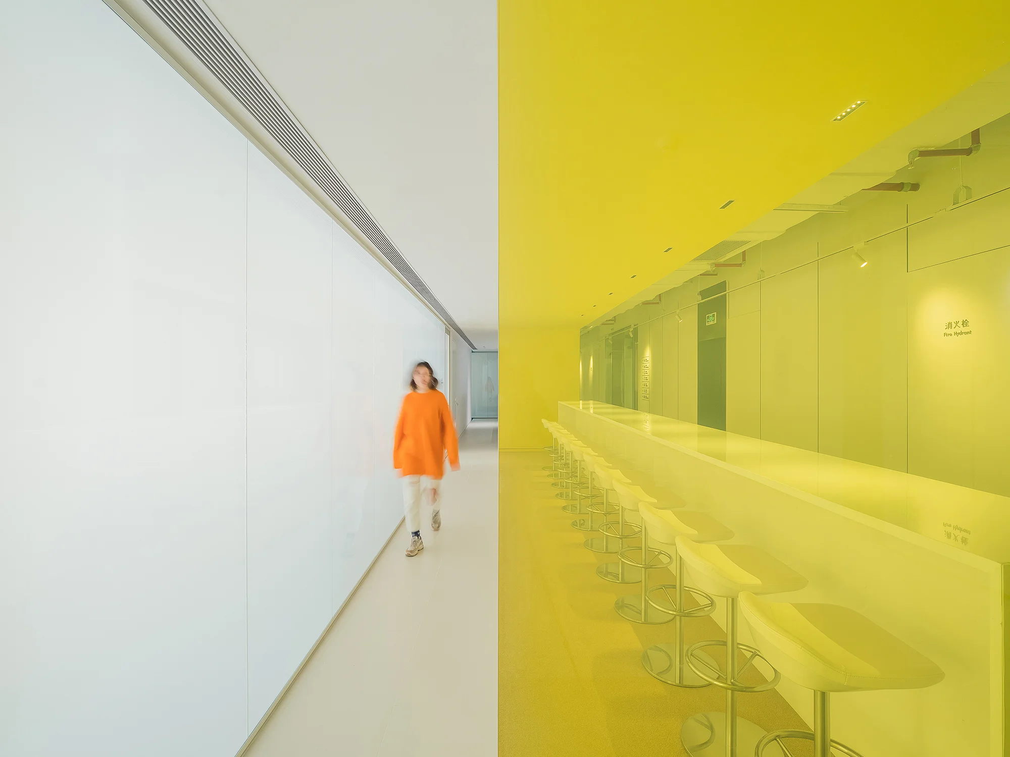
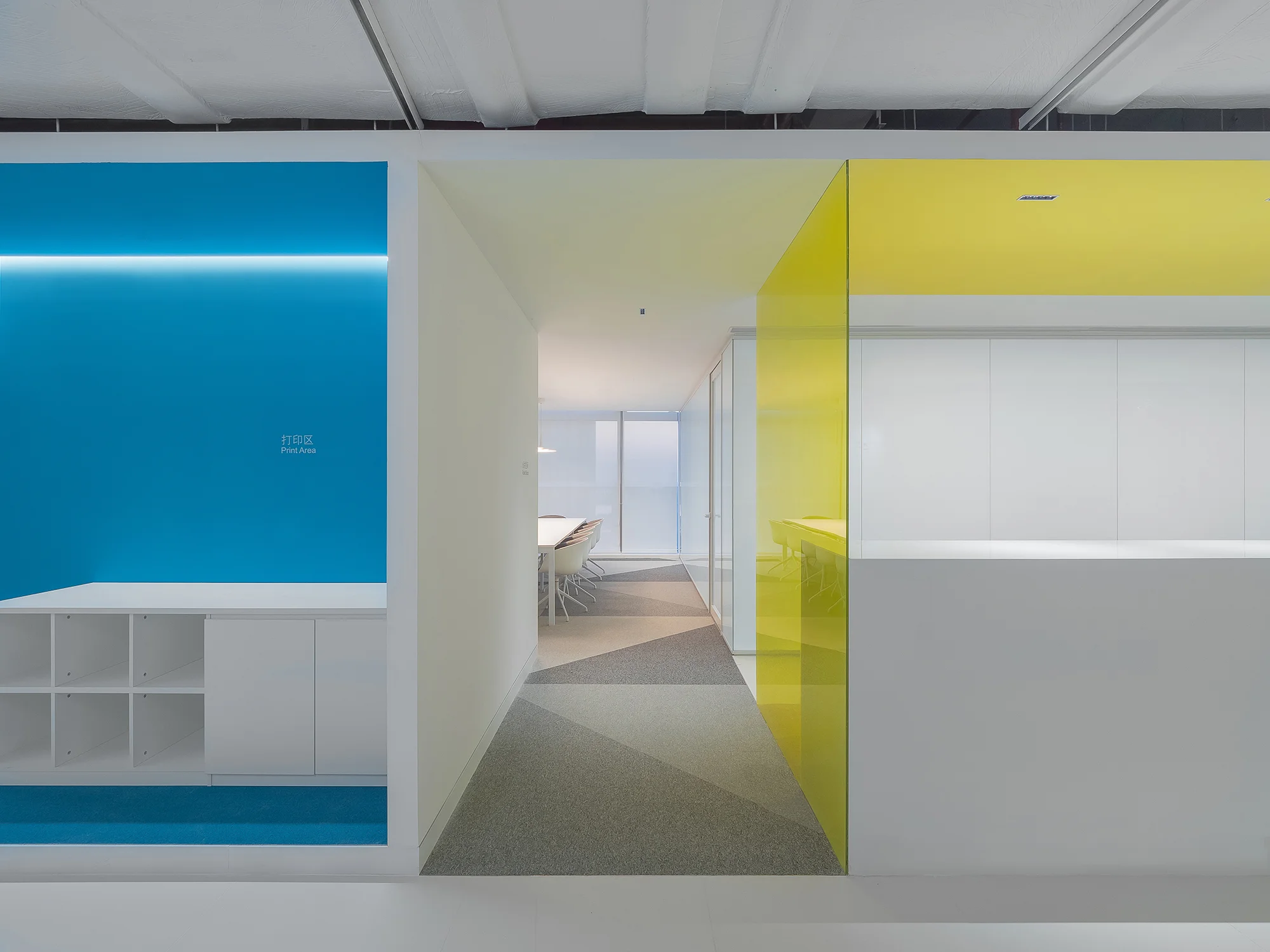
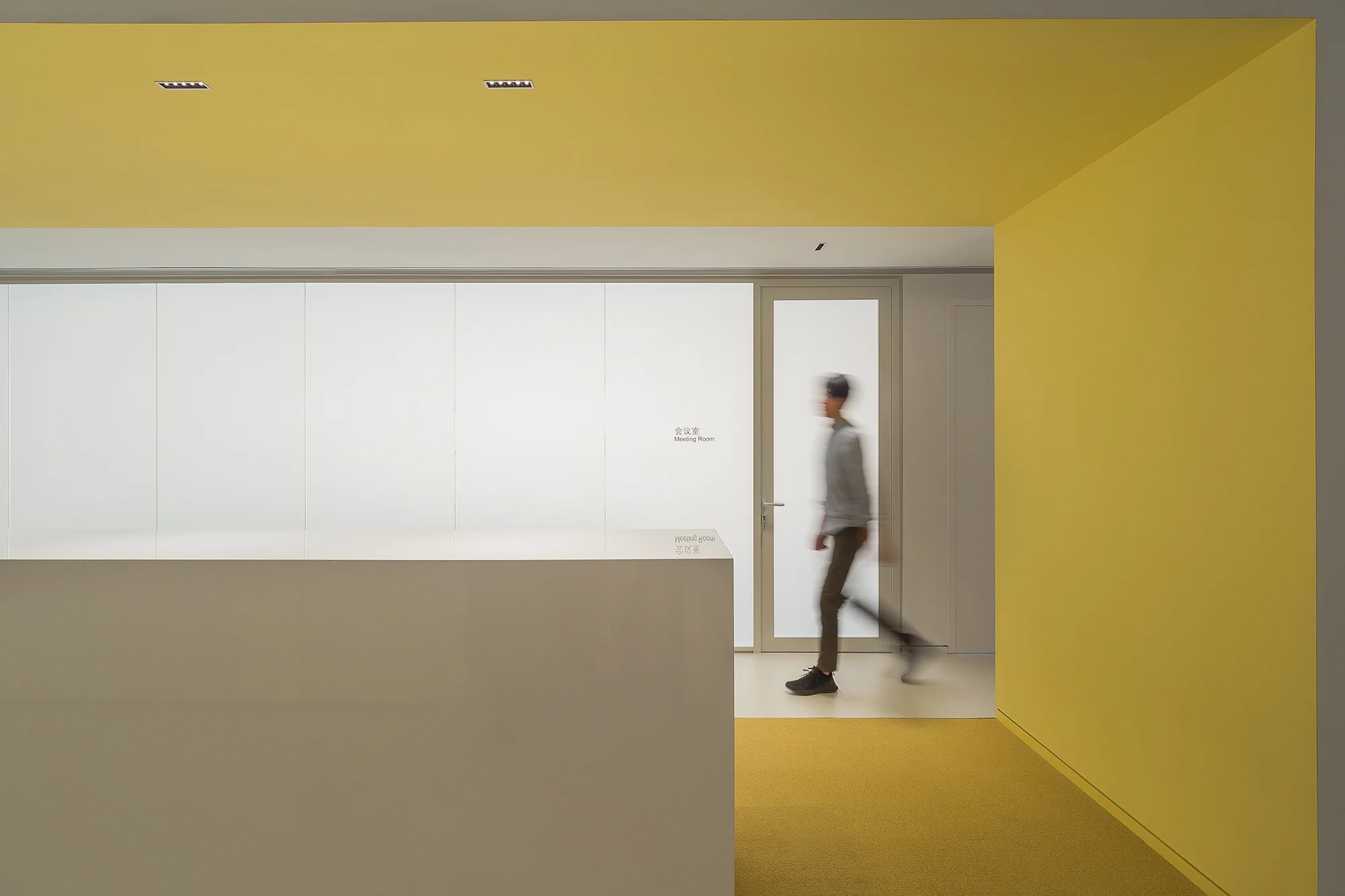
Yellow accents distinguish shared settings from white working areas, while a long counter creates an informal place to stop. The reception uses a darker material accent within a largely light envelope. The reference invites a workplace discussion about where colour can aid orientation, and where a calmer background is better suited to everyday concentration.
SPATIAL READING
Yellow accents distinguish shared settings from white working areas, while a long counter creates an informal place to stop. The reception uses a darker material accent within a largely light envelope. The reference invites a workplace discussion about where colour can aid orientation, and where a calmer background is better suited to everyday concentration.
Editorial observations drawn from the supplied imagery.
Included as a design reference; not presented as a commission completed by this practice.
THREE SPATIAL IDEAS
A visible feature to consider alongside your own programme, users and operating requirements.
A visible feature to consider alongside your own programme, users and operating requirements.
A visible feature to consider alongside your own programme, users and operating requirements.
FOR YOUR NEXT PROJECT
Which teams need quiet focus, enclosed calls or frequent collaboration? Use these images as a starting point for discussing the actual mix of rooms, rather than copying a layout without its business context.
Decide where the business needs a memorable public impression and where a quieter environment is more useful. The boundaries between visitors, executive hospitality and staff work are an important part of that decision.
Record the floor area, base-building constraints, headcount, furniture and technology requirements. A considered image becomes a useful design direction only when those inputs and responsibilities are clear.